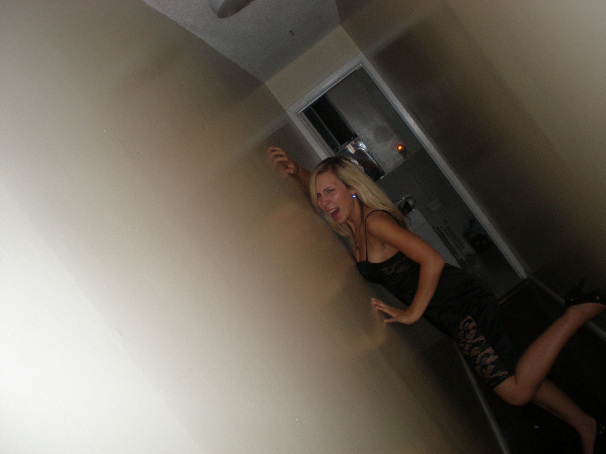
The hallway in our apartment has always been kind of creepy. It’s long and narrow, the floor is uneven, and it’s poorly lit. When we first moved in, the light flickered like something out of a horror movie. It was such a terrifying hallway to walk down that it’s eeriness has become an ongoing joke amongst our friends.
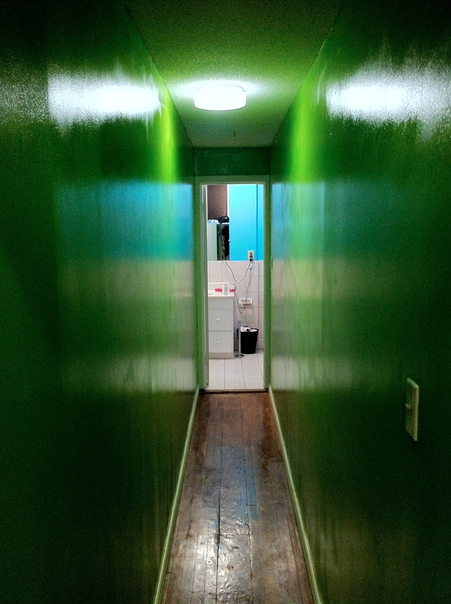
So the other week my roommates and I decided to paint it. We found an excellent green color that worked quite well with the blue in our bathroom. At least… it only worked well when the light was on during the part of sunny day in which the light shone through the bathroom window. Otherwise, it appeared to have the texture and color of a Lovecraftian horror:
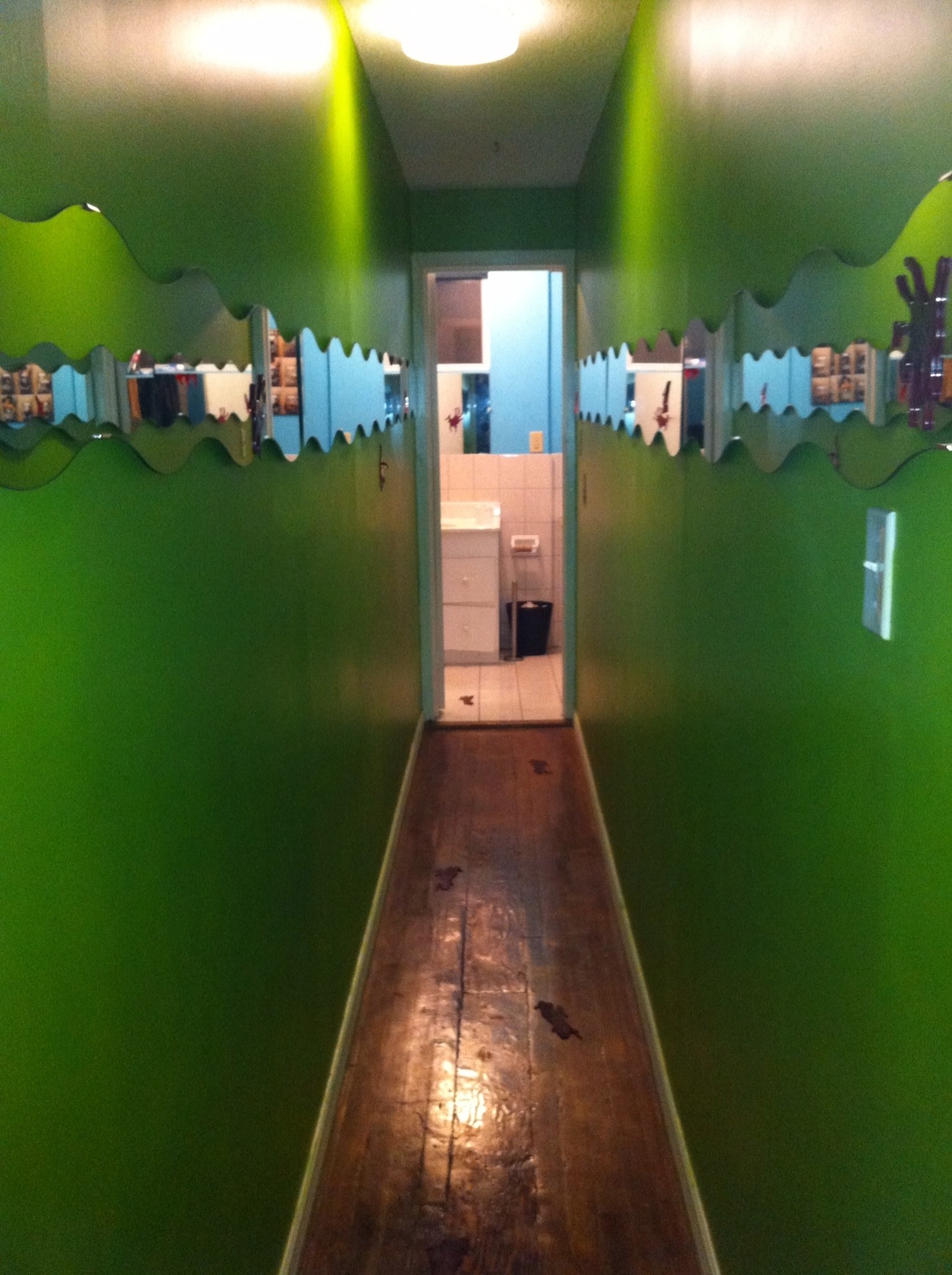
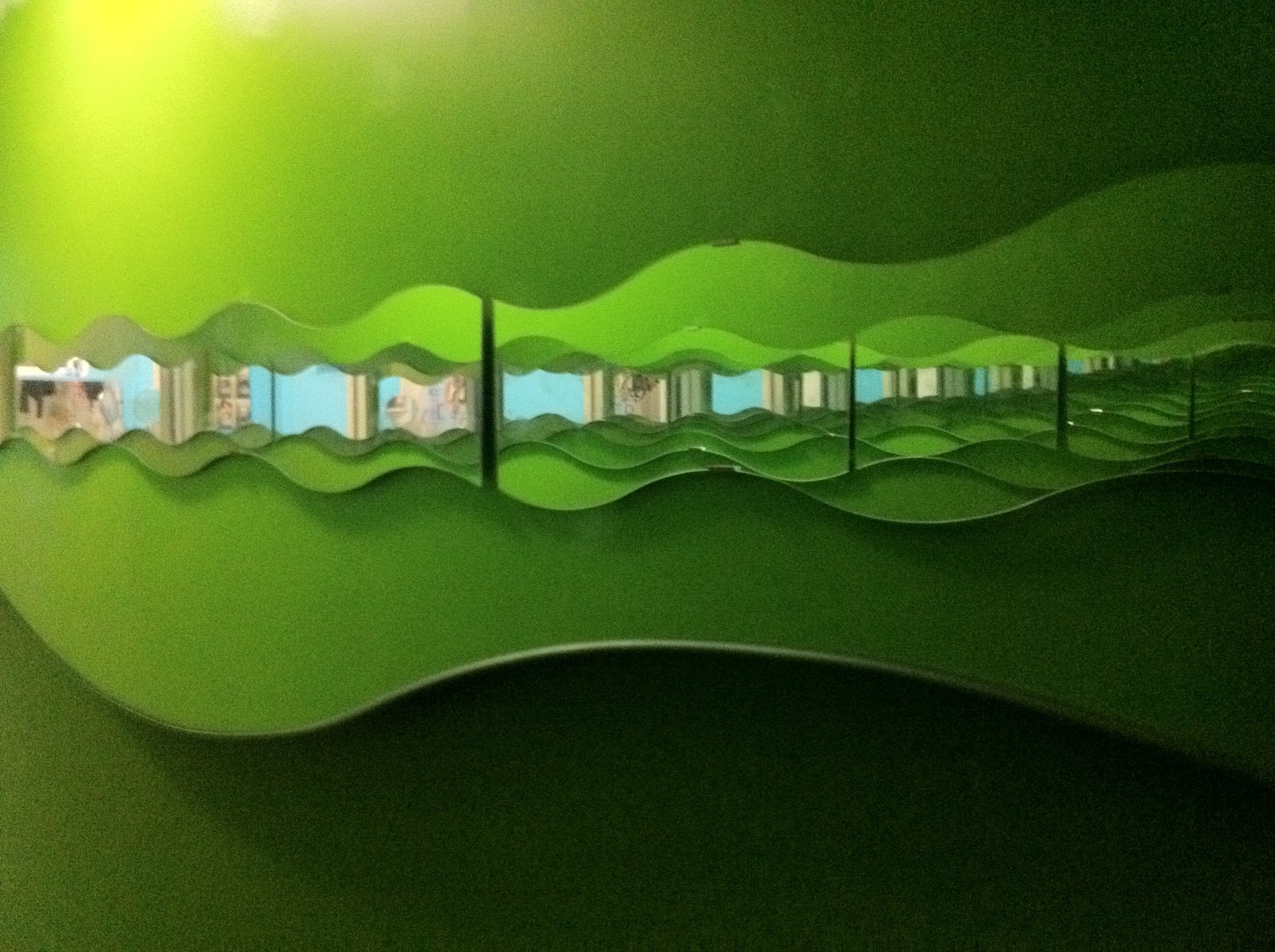
So we decided that mirrors were the only option. And naturally, the only logical thing to do with a narrow hallway and MIRRORS is to make it look as much like a fun house as you possibly can. After a quick trip to IKEA, we arrived home two $15 packs of 3 wavy mirrors. I gathered that their original purpose was to place them parallel to each other, but we had other plans. By placing them end to end down the entire length of the hallway – on both sides of the hallway – we essentially open up our dark, narrow, and downright spooky hallway infinitely on either side.
In theory, this should have been easy. Just line up three mirrors perfectly level and exactly opposite another set of mirrors that also have to be perfectly level. How hard could that be, right? Well if every god damn surface in the entire hallway is uneven, it turns out it was pretty damn hard. I’m not kidding about the every surface being uneven bit either. The floor is slanted in every way it could possibly be slanted, both walls bulge near the middle (but not in the same spot), and there isn’t a single proper right angle in the whole damn place.
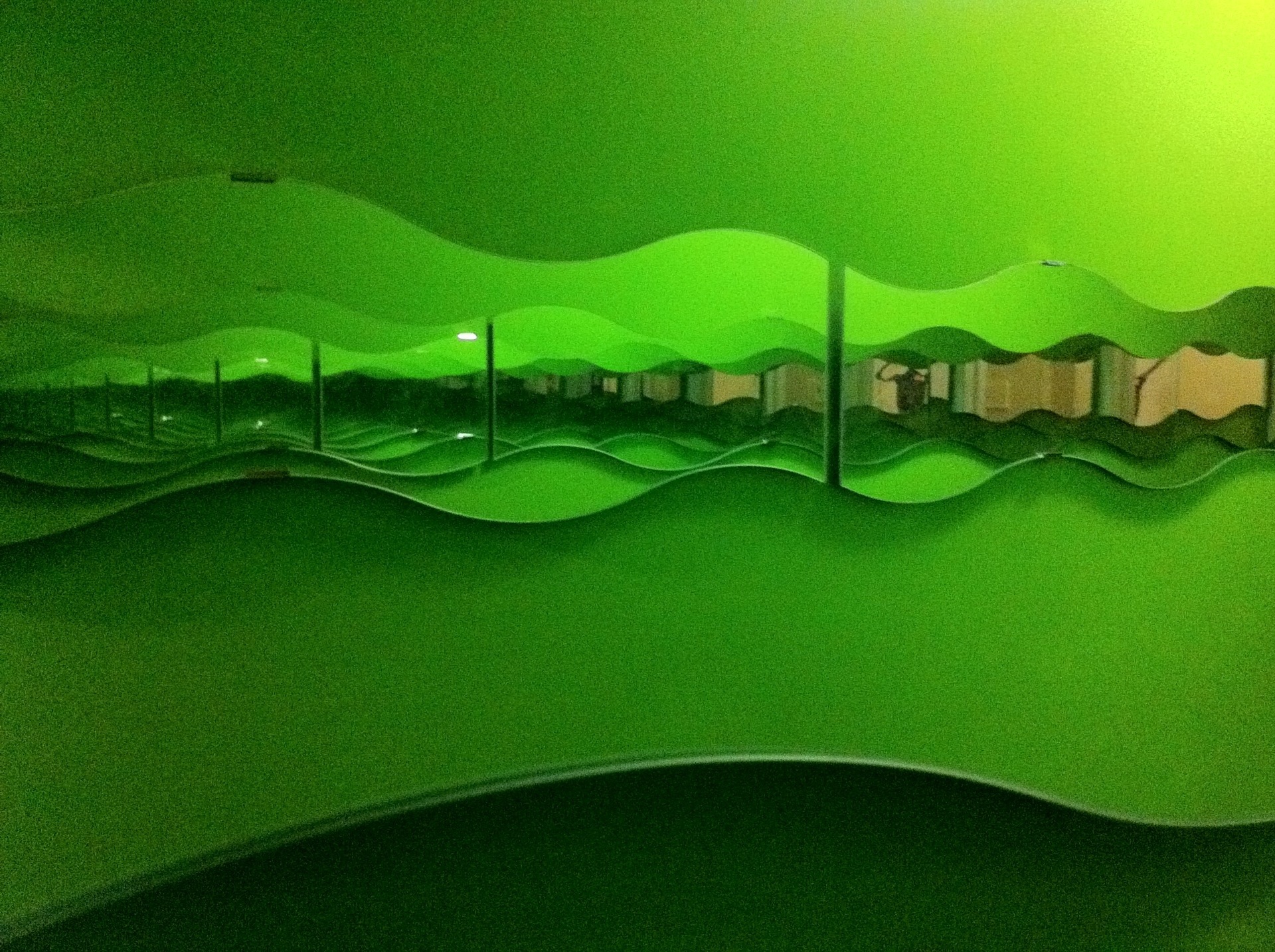
But somehow we did it. The mirrors reflect each other almost perfectly, and I think that’s pretty good for two surfaces that have absolutely ZERO parallel subsections. Light is able to bounce around more freely, so the entire room appears brighter. And I guess that’s great and all, but look at this thing a little more closely:
Look at those waves! Because of the way the mirrors are cut, placing then opposite of each other puts the high point of one period exactly across from the low point of a period on its opposing mirror. Extended infinitely, it creates a far more realistic illusion of depth than it would have if everything was perfectly lined up. Lush, rolling green hills, extending into infinity on either side… kind of like what you’d imagine Scotland looks like after doing a lot of acid and playing a “Little Big Planet” for 4 hours. And as a bonus, walking down it causes the waves to appear to roll, overlapping each other as your angle changes while you walk!
Did the mirrors improve the lighting? A Little. Did the mirrors make the hallway less creepy? Well… Yes, but they also made it into something even more visually jarring than just a dark, non-Cartesian hallway.
So… Mission accomplished?
